Disability Pride Flag
Disability Pride Flag ·
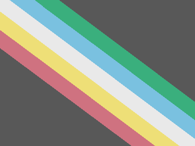
Ann Magill released the current Disability Pride Flag on October 13, 2021 after collaborating with disabled people who experienced visually triggered symptoms from the earlier zigzag. The revision uses five straight, muted stripes on a charcoal field, with brightness increasing toward the central white stripe. Magill released it under CC0 and later updated her explanation of its symbolism without changing the design. [1] [2]
Key facts
- Designer
- Ann Magill
- Created
- First published
- In use
- 2021 to the present
- Aspect Ratio
- Not standardized
- Ratio Notes
- Magill prescribed no overall proportion and kept the flag's proportions flexible. Her release post carries a 400 by 300 rendering, which is 4:3, and links a 1920 by 1080 rendering, which is 16:9. [1] The 4:3 file shown here is the creator-posted release image, not a design specification. The 2016 proposal's 169 by 101 image is a different proportion again; the stages of the design share no mandatory ratio.
- Stripes
- 5
- Origin
- United States
- Represented Identity
- disabled people
Also known as
- Visually Safe Disability Pride Flag
- Disability Pride Flag (2021 revision)
- Magill Disability Flag
Status Canonical
Archive categories Disability Pride Flags
Overview
To give disabled people a public symbol that asserted disability identity outside the closed institutional spaces in which Magill had repeatedly seen disability commemorations confined, and to create a banner the disability community could carry into the same public spaces where other Pride symbols were already flown. [1]
A revision rather than a first design. Magill made the original in 2016, publishing it on 10 August that year as a proposal on her Dreamwidth journal, and waived her rights in it on 4 June 2019. [3] [1] The idea began at a 2010 observance for the 20th anniversary of the Americans with Disabilities Act, which she found ‘confined to the basement and grounds of the regional Independent Living Center, instead of out in the public.’ Six years later, after the July 26, 2016 mass killing at the Tsukui Yamayuri En care home in Sagamihara, Japan, in which a former staff member murdered nineteen disabled residents and injured twenty-six because, by his own confession, they were disabled, Magill ‘was driven to design an actual flag, instead of just wishing we had one.’ [1] This entry covers the 2021 design; the original is a separate record.
Identity & Context
- Represented Identity
- disabled people
- Subcommunity
- the broad disability community across physical, sensory, neurodivergent, psychiatric, and invisible/undiagnosed disabilities
- Movement
- Disability Pride, disability rights, Disability Pride Month
- Language Context
- English-language origin, but designed to be reproducible from globally available standard flag colors
- National Context
- Created in the United States; subsequently adopted at events in Canada, Australia, the UK, and elsewhere [4]
The flag is not specifically an LGBTQ+ symbol and represents disabled people of all sexualities and genders. It is included here because it has become a recurring component of intersectional Pride imagery and because the Disability-Inclusive Pride Flag (Vecchietti, 2024) and other Progress-lineage variants explicitly draw on its color system.
Creators
The Creator
Ann Magill
Lead designer and publisher of the collaborative revision
Ann Magill is a disabled writer and artist who published the first Disability Pride Flag proposal in 2016. She posts as capri0mni on Dreamwidth and Flickr, and as capricorn-0mnikorn on Tumblr. After the zigzag design caused visually triggered symptoms for some viewers, she worked with disabled community participants to produce the straight-diagonal revision released in 2021. [1]
Several people in the Disability community on Tumblr, collaborated and came to a consensus on a new design. [1]
Since this flag is in the Public Domain, that means it already belongs to you. It belongs to Everybody. Period. [1]
Motivations
- Frustration with a 2010 ADA-anniversary observance held inside an Independent Living Center basement rather than in public space [1]
- Response to the 2016 Sagamihara care home massacre, in which nineteen disabled residents were killed [1] [5]
- A long-held wish for a flag that would let disabled people identify themselves to one another and assert disability as a public identity [1]
Stated inspirations
- The six internationally recognized standard flag colors (also used by the Olympic flag), chosen so the flag could be reproduced anywhere from materials people could actually find[1]
- LGBTQ pride and Black pride as movements that demonstrated how a flag could function as both a community symbol and a public claim[4]
Disabled community collaborators
Accessibility feedback and collaborative redesign
The 2021 revision was a collective product. After reports in July 2021 that the zigzag could trigger symptoms when scrolled on backlit screens, "several people in the Disability community on Tumblr, collaborated and came to a consensus on a new design": removing the zigzag, muting and reordering the colours, and testing the result for accessibility. Magill credits the collaboration; the individual participants were not all named, and none are named here. [1]
Attribution notes
Magill considers the 2021 design a collaborative product of her work and feedback from the disability community on Tumblr. She declined to accept monetary tips for the flag in order to keep its public-domain status uncomplicated. [1]
Origin
- Country
- United States
- Specific Place
- capri0mni.dreamwidth.org / Flickr
- Place Type
- personal blog and image hosting
- Digital Origin
- Yes
Magill posted the 2016 original and the formal copyright waiver on her Dreamwidth journal under the username capri0mni, with the canonical image hosted on her Flickr account. She updated the same Dreamwidth post in October 2021 with the redesigned version. [1]
Dates & Chronology
- Year Created
- Exact date
- First published
- Period in Use
- 2021 to the present
Magill reported in July 2021 that the flag had been "almost totally unknown for the last two years" until it began circulating on Reddit and Tumblr in the weeks before Disability Pride Month 2021. [1] After the revision's release that October it spread through disability organisations' materials, reference works and July Disability Pride Month observances. Documented adopters with stable sources include Disability Belongs, the Sibling Leadership Network, and Columbia University Irving Medical Center's Weinberg Family Cerebral Palsy Center. [6] [7] [5] Municipal and school-district flag-raisings and a Canadian Disability Pride crosswalk have been reported; the press records for those events are not held here with stable addresses, so they are carried as reported rather than cited adoption.
Major revisions
Magill released a redesigned version after disabled users reported that the original zigzag pattern caused a strobe effect when scrolled on backlit screens, posing a seizure and migraine risk. The revision replaced the zigzag with a single straight diagonal band of five parallel stripes; muted the colors; changed the field from black to charcoal grey; rearranged the stripe order so warm colors (red, gold) and cool colors (blue, green) flank the central white stripe (separating red and green for red-green colorblindness); and adjusted brightness so that the stripes radiate from brightest at the center toward darker on the outside. Magill worked through the consensus process with Tumblr disability community members through July 2021 and finalized the design in October. She removed the zigzag version from her own image archive but noted it remains in the public domain. [1] [6]
Magill restated the flag's meaning, redefining the five bands to stand collectively for the diversity of the disabled community rather than each naming a category of disability. The design itself did not change. [2]
Disability Pride Month, observed in July to mark the anniversary of the Americans with Disabilities Act (signed July 26, 1990), traces its public origins to the first Disability Pride Day in Boston on October 6, 1990, the first Disability Pride Parade in Chicago in 2004, and Mayor Bill de Blasio's 2015 declaration of July as Disability Pride Month in New York City. Magill's flag was created and revised within this broader observance context but predates the wide institutional adoption of Disability Pride Month outside the United States. [4]
Lineage
- Related flags
- Intersex-Inclusive Pride Flag
One version chain: the 2016 four-stripe proposal, the later five-stripe zigzag documented on the 2016 entry, and this straight-diagonal revision. The revision retains the multicolour diagonal concept while adding white, straightening the band, muting and reordering the palette, and lightening the field from black to charcoal. [1] [3] The redesign was creator-led and community-informed, made for accessibility after the zigzag's strobe risk surfaced. Downstream, the flag's stripes were incorporated into Valentino Vecchietti's 2024 Disability-Inclusive Pride Flag and related intersectional designs, where direct borrowing is documented on those entries. No visual or genealogical relationship to the Rainbow Pride Flag is documented: the flag shares Pride's public vocabulary, not Baker's design.
Lineage tree
Every record reachable from this one through documented parent and child relationships: 4 records across 3 generations.
- This record
- Disability Pride Flag
Colors & Symbolism
Magill revised how she wants the flag read in 2026: the five central colours stand collectively for the diversity of disabled people, and the six colours together for the breadth of the disability community, rather than one condition category per stripe. The dark field carries rage at injustice and fighting back, with her original pirate-flag reference preserved, and the diagonal band cuts through the barriers disabled people face. The artwork did not change. [2] [1]
| Colour | Hex | Meaning | Note |
|---|---|---|---|
| Red | #CF7280 | Historical per-stripe meaning: physical disabilities. [1] | Creator-attributed specification reproduced across reference sources. [4] [8] |
| Gold | #EEDF77 | Historical per-stripe meaning: neurodivergence. Magill confirmed in a 2022 reply, "The Gold Stripe represents all neurodivergence." [1] | Creator-attributed specification reproduced across reference sources. [4] [8] |
| White | #E9E9E9 | Historical per-stripe meaning: invisible and undiagnosed disabilities. [1] | Creator-attributed specification reproduced across reference sources. [4] [8] |
| Blue | #7AC1E0 | Historical per-stripe meaning: psychiatric disabilities. [1] | Creator-attributed specification reproduced across reference sources. [4] [8] |
| Green | #3AAF7D | Historical per-stripe meaning: sensory disabilities. [1] | Creator-attributed specification reproduced across reference sources. [4] [8] |
| Charcoal Grey (field) | #585858 | — | Hex and RGB values widely reproduced from creator-shared specifications; Magill is the documented source. [4] [8] |
- Charcoal grey field
- Mourning and rage for disabled people lost to ableist violence, abuse, neglect, suicide, eugenics, and illness. Originally rendered as black on the 2016 design and softened to charcoal grey in the 2021 revision.
- Diagonal band
- Cutting across the vertical walls and horizontal ceilings that segregate disabled people from public life
Magill assigned each stripe an individual category when the revision was released, and those meanings circulated widely. In July 2026 she explained why she was moving away from fixed per-stripe categories: a collaborator had pointed out that "categorizing disabilities the way I had, initially, reinforces the Medical Model of Disability, which runs counter to Pride", and she agreed, adding that specificity "can shut down a conversation rather than open up." The bands are now to be read together, as the diversity of disabled people, with the older category meanings preserved above as historical interpretation. The older meanings were not always false; the creator changed how she wants the bands interpreted, and the artwork did not change. [2]
Magill published explicit digital values for illuminated-screen use, in hexadecimal and RGB, in her Reddit explanation of the redesign: #585858 for the charcoal field and #CF7280, #EEDF77, #E9E9E9, #7AC1E0, #3AAF7D for the stripes. The table carries those creator-issued values. [9] The slightly different values in the Wikimedia Commons SVG are characteristics of that later technical rendering, not replacements for the published palette. [10] For physical manufacture Magill suggested more saturated Pantone approximations; those are production guidance, not the screen palette. [9]
Design
- Aspect Ratio
- Not standardized
- Ratio Notes
- Magill prescribed no overall proportion and kept the flag's proportions flexible. Her release post carries a 400 by 300 rendering, which is 4:3, and links a 1920 by 1080 rendering, which is 16:9. [1] The 4:3 file shown here is the creator-posted release image, not a design specification. The 2016 proposal's 169 by 101 image is a different proportion again; the stages of the design share no mandatory ratio.
- Orientation
- diagonal
- Stripe Count
- 5
- Layout
- diagonal_band_on_field
- Stripes (Left → Right)
- Red, Gold, White, Blue, Green
A single diagonal band running from the upper-left corner to the lower-right corner of the field, composed of five parallel stripes of equal width. Across the band from its upper edge to its lower the stripes run green, blue, white, gold, red; along a horizontal line they read red, gold, white, blue, green. This places the warm and cool colours on opposite sides of the central white stripe, separating red from green for viewers with red-green colourblindness and reducing flicker when the image is scrolled on a backlit screen. On the 2016 original the red stripe sat directly beside the green. Stripe brightness is graded so the central white stripe is brightest and the outer stripes are slightly darker. [1]
Magill's published construction is relative: five stripes of equal width, each one tenth of the flag's total length, the full coloured band occupying one half of the flag's length, and the central diagonal passing through the middle of the white stripe. Across a horizontal line the sequence is red, gold, white, blue, green; across the band from its upper edge to its lower edge the sequence reverses. [2]
A charcoal grey field crossed from the upper-left corner to the lower-right corner by five parallel stripes in muted red, gold, white, blue, and green. The stripes form a single diagonal band rather than a zigzag. The 2016 original used the same five colors in brighter saturations on a black field, arranged as a five-segment zigzag rather than a diagonal band. Magill removed the zigzag version from her own image gallery in October 2021 but it remains in the public domain. [1]
Usage & Adoption
- First Users
- Ann Magill (October 2021, capri0mni.dreamwidth.org)
- Organizations
- Disability Belongs (formerly RespectAbility), Sibling Leadership Network, Weinberg Family Cerebral Palsy Center, Columbia University Irving Medical Center
- Geographic Usage
- United States, International Disability Pride Month observances
- Online Usage
- Reddit and Tumblr (initial viral circulation, mid-2021), Disability advocacy organization websites and social media during July Disability Pride Month
- Event Usage
- Disability Pride Month observances (July), including flag displays and raisings; individual events are recorded when a stable source directly documents the design shown.
- Current Status
- active
Magill's own account places the flag's adoption arc in two phases: an initial period from June 2019 through mid-2021 in which the flag was 'almost totally unknown,' followed by a sudden surge of attention on Reddit and Tumblr that prompted both wide use and the discovery of the strobe-effect accessibility problem. The 2021 redesign coincided with broader institutional adoption. [1] [4]
Image Archive
The design
Discourse & Debates
- Whether the flag's category boundary places it within LGBTQ+ pride flag archives at all. The flag is not specifically an LGBTQ symbol and represents disabled people of all sexualities and genders, but it has been integrated into the Progress Pride lineage by Vecchietti's 2024 Disability-Inclusive Pride Flag and is regularly displayed alongside other Pride flags during July Disability Pride Month.
- Magill engaged the Wikipedia talk page for the Disability flag article between April and June 2022, explicitly identifying herself as the designer of the zigzag flag and asking that the image be removed because it 'is Dangerous to people with visually triggered Epilepsy.' Editors Pyrrho the Skipper, Tazuco, and Laurier worked to incorporate the redesign and locate sources. Editor Slywriter, while granting that the redesigned flag was 'too new to be recognized by a Significant community,' separately questioned the article's framing and the parallel promotion of the unrelated gold-silver-bronze Eros Recio Disability Flag (which had been added by a single-purpose Wikipedia account, NaviNews, in five languages). Magill also documented the same dispute in her own Dreamwidth post, paraphrasing the response to her objections as her not having a valid claim 'because I'm commenting from too vested an interest,' which she called 'very frustrating.' A separate July 2022 file talk page comment by user Vermiceli also asked that the zigzag image be replaced for the same accessibility reason. As of December 2025 (the article's most recent edit before this entry was written), the dual-flag confusion and the slow Wikipedia uptake of the 2021 revision remain documented features of the article. [1] [11] [12]
Common misidentifications
- The 2016 proposal, the later five-stripe zigzag, and the 2021 straight-diagonal flag are different stages of one design history. Images of the withdrawn zigzag should not be labelled as the current Disability Pride Flag. [1]
- The flag is not specifically an LGBTQ+ symbol. It represents disabled people of all sexualities and genders, and appears alongside Pride flags through Disability Pride and later intersectional designs.
Criticisms
- The earlier zigzag could create a flicker or strobe effect when scrolled on illuminated screens. After disabled viewers reported seizures, migraines, disorientation and eye strain, Magill worked with community participants on a straighter and more muted design. The withdrawn version remains easy to encounter because it is public domain. [1]
Magill refers to the current version as the 'Visually Safe Disability Pride Flag.' Some institutional sources call it the '2021 Disability Pride Flag' or simply 'the Disability Pride Flag,' since the zigzag version has been retired by the creator. [1] [6]
Footnotes & Citations
Sources and footnotes 12 sources
- 1. Social media This morning (4 June, 2019) I have officially waived all copyright to my Disability Pride Flag. Ann Magill (capri0mni). Dreamwidth (2019-06-04). Accessed 2026-08-15
Magill's June 4, 2019 public-domain post, updated October 13, 2021 with the withdrawal of the zigzag, the collaborative redesign, the CC0 mark, and the 400 by 300 release rendering.
- 2. An answer to Several Questions… about why I'm proposing moving away from each colored stripe representing a specific "type" of Disability. Ann Magill (capricorn-0mnikorn). Tumblr (2026-07-11). Accessed 2026-08-15
The July 11, 2026 symbolism update: the creator's reasoning for reading the five bands collectively as disabled diversity, crediting a collaborator's point that fixed categories reinforce the Medical Model of Disability.
- 3. Primary statement This is my proposal for a Disability Pride Flag. Ann Magill. Notes, Notings, and Common Refrains (Dreamwidth) (2016-08-10). Accessed 2026-08-15 · Archived version
The 2016 proposal, the start of the version chain.
- 4. Disability flag. Wikipedia. Accessed 2026-04-07
- 5. History of the Disability Pride Flag. Weinberg Family Cerebral Palsy Center, Columbia University Irving Medical Center (2023-07-03). Accessed 2026-04-07
- 6. Have You Seen The New Disability Pride Flag?. Becca Block. Disability Belongs (formerly RespectAbility) (2022-07-15). Accessed 2026-04-07
- 7. About the Disability Pride Flag. Sibling Leadership Network (2024-07-16). Accessed 2026-04-07
- 8. Disability Pride Flag: Meaning, Symbolism, and Community Significance. Ian C. Langtree. Disabled World (2025-04-19). Accessed 2026-04-07
- 9. The Disability Pride Flag by Ann Magill (me) has been updated. Ann Magill. Reddit (r/disability) (2022-05-03)
Magill's Reddit explanation of the redesign, with her published hexadecimal and RGB values, construction notes, symbolism, accessibility reasoning and public-domain statement. Reddit blocks automated access, so this pass could not re-read the thread; the values are carried on the site owner's verification.
- 10. Image file page File:Visually Safe Disability Pride Flag.svg. Ann Magill. Wikimedia Commons (2022-07-21). Accessed 2026-08-14
A vector of the revision on Commons, 400 by 300, released CC0 with Magill named as author. Uploaded by a third party in August 2022. Its title, "Visually Safe", is the distinction the revision was made to draw.
- 11. Talk:Disability flag (Wikipedia talk page). Multiple Wikipedia editors including Ann Magill. Wikipedia (2021–present). Accessed 2026-04-07
- 12. File talk:Disability Pride Flag Ann Magill copyrights waived.svg. Vermiceli. Wikipedia (2022-07-11). Accessed 2026-04-07


Image Sources
- Rendering
- 2021 Visually Safe revision
- The creator-posted release rendering, 400 by 300, from the updated Dreamwidth post of October 13, 2021. Magill also links a 1920 by 1080 rendering; she prescribed no single proportion. CC0 1.0. [1] · Credit: Ann Magill · Dreamwidth · 400 × 300
- Wikimedia Commons' later SVG rendering, nominally 400 by 300, uploaded July 21, 2022 by Tonyskapunk and later optimized by Smasongarrison, with the design credited to Ann Magill. Its values differ slightly from Magill's published palette. CC0 1.0. [10] · Credit: Design: Ann Magill; vector: Wikimedia Commons contributors · Wikimedia Commons · SVGRights CC0 1.0 as recorded on the file page. [10]